Digital Wayfinding Options
Digital wayfinding has been one of the most popular developments in digital signage in the last 6 years when we saw a noticeable uptake in customers evaluating solutions based on support for “wayfinding,” in general- driving rapid growth for several digital signage software leaders, including the San Jose-based 22Miles and Montreal-based X2O/Barco.
Leading digital wayfinding signage systems tout the ability to take an image of a map (often enhanced from a basic CAD file to highlight particular areas of a building or campus, with clearly labeled rooms and points-of-interest) and make it interactive, for zooming and such. In many cases, animated paths can be drawn from the “You Are Here” location (the kiosk) to a destination the user has selected from a list.
This type of wayfinding has come to be called “interactive pathfinding”. But it’s not the only type of wayfinding you can use for digital signage. In fact, in certain cases interactive pathfinding may be unnecessary, and end up being under-utilized (the worst possible fate for your technology investment). At Creating Margin, drawing from over 10 years of experience implementing wayfinding systems of all kinds, we have identified different types of digital wayfinding which we’ll explain below.
If you have questions about how different digital wayfinding signage systems might work for your business, send us a note using the contact form below.
Non-Interactive Options
STATIC WAYFINDING – MAP ONLY
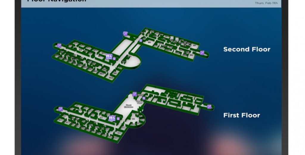
Static Wayfinding is helpful if you’re looking to start with the basics. It doesn’t always need to be interactive to help people navigate!
STATIC WAYFINDING – WITH LEGEND
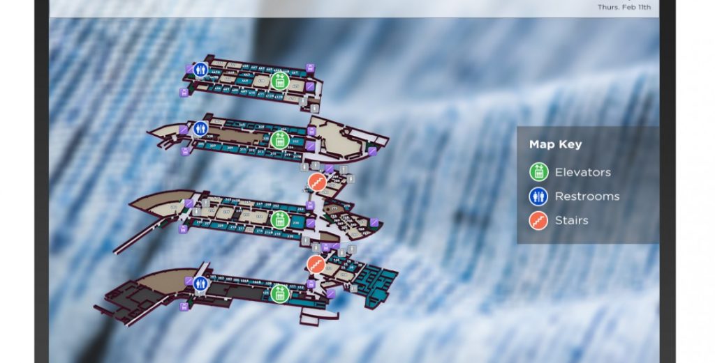
Wayfinding with icons and a key are very helpful for large facilities. Especially airports, hospitals, universities and more.
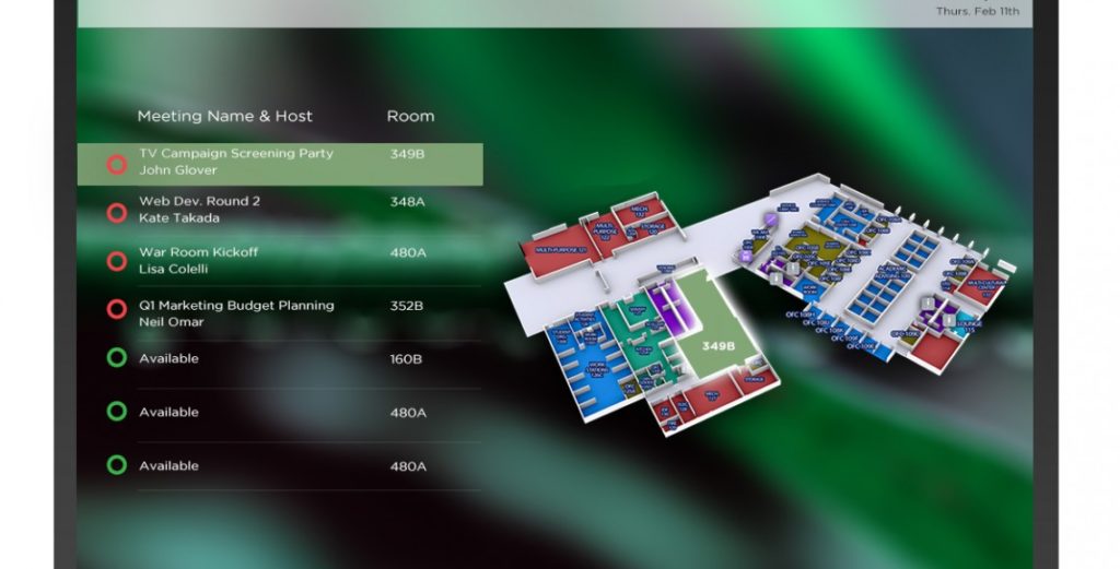
DYNAMIC BEACON WAYFINDING
Showing an events list, that shows the location of the event on the map, is also a valuable form of wayfinding. This could be great for large corporate offices.
Interactive Options
INTERACTIVE PATHFINDING
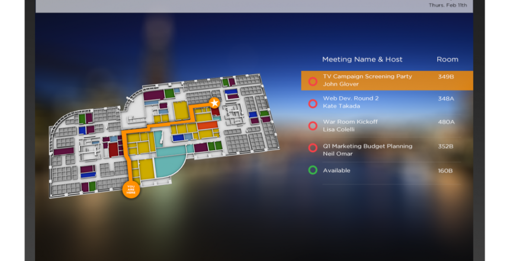
Interactive Wayfinding can be as simple as a tap. If the user tapped the event on the right side, an animated path would appear on the left.
TURN BY TURN DIRECTIONS
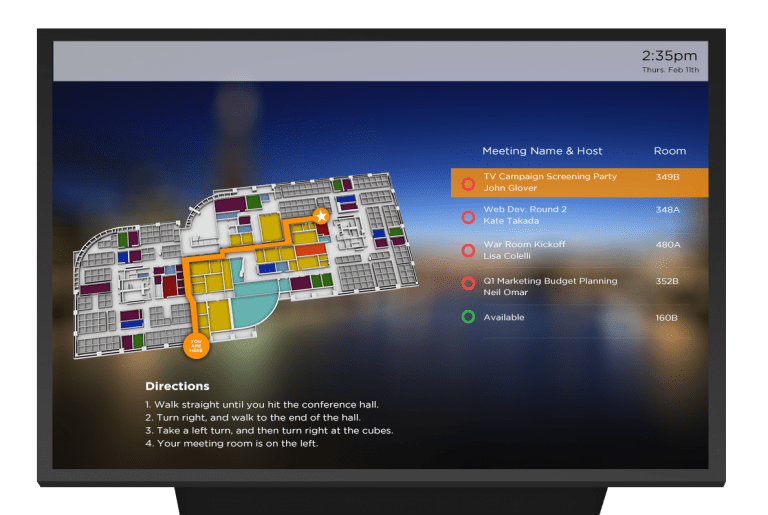
Even with the animated path, it’s also helpful if wayfinding includes instructions on how to get to the next point. Consider adding steps into your wayfinding.
INTERACTIVE MAP WITH POP-UPS
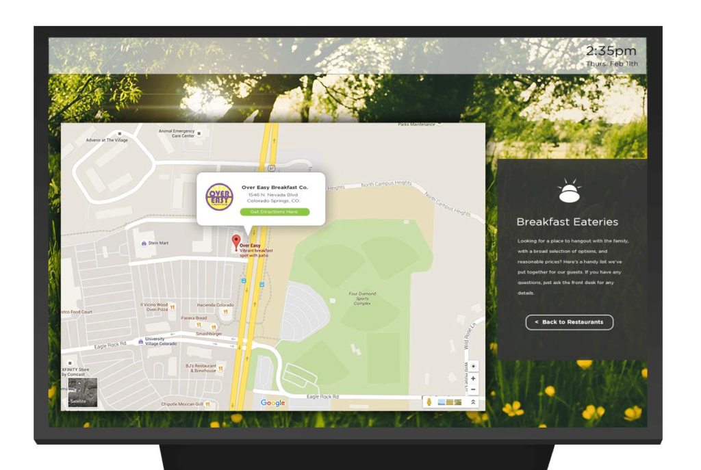
Ever seen this in the lobby of a hotel? They might have popular things to do listed on a page, and have it open up to a Google Maps page on a large screen for you to look at.
Mobile Wayfinding
GPS “MAPS”
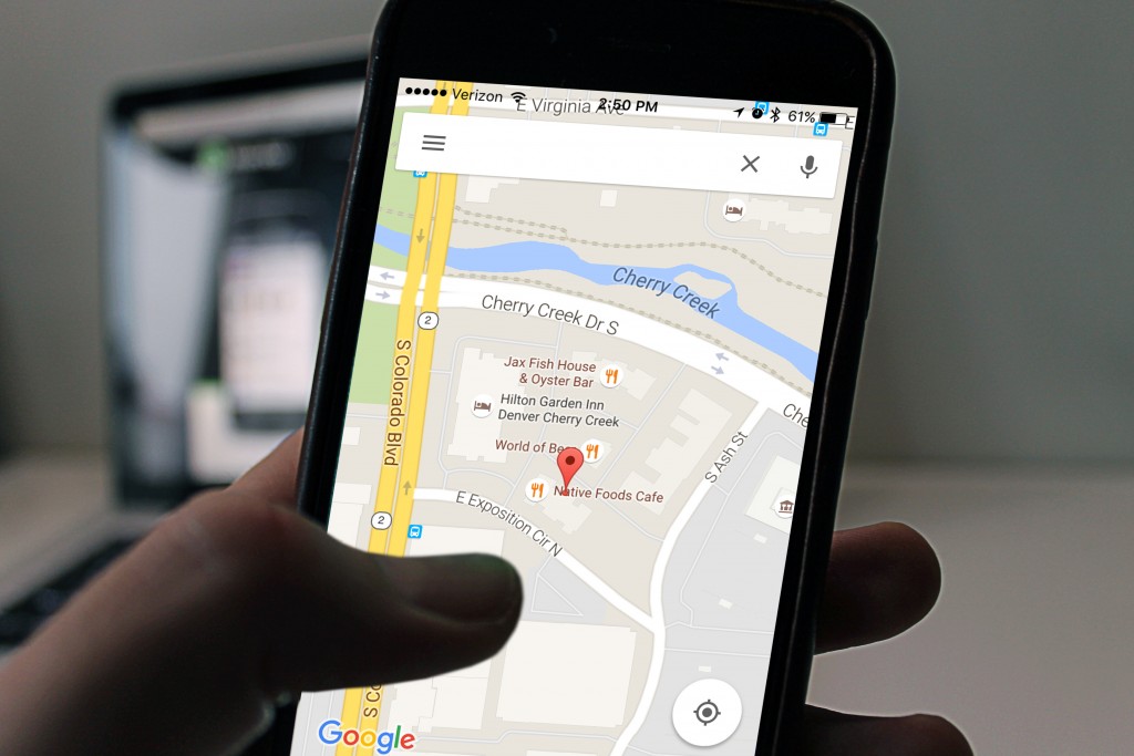
Yes, another form of wayfinding is something we use every day; GPS systems! Google Maps, Waze, and i-Maps are all examples of these.
BLUETOOTH ENABLED WAYFINDING

With a dynamic wayfinding beacon, users can connect to the beacon using their smartphone. This allows them to navigate from wherever they are, rather than needing to be in front of a kiosk.
ROOM BOOKING APPS
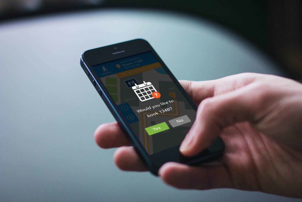
Finally, dynamic wayfinding can even include apps that help the user book a room for a meeting, all while using Bluetooth.
What’s your favorite type of digital wayfinding? Share with us below on a way you use this for your office, store, or your building. With the digital signage constantly improving, it’s great to hear how wayfinding affects your lifestyle.


